Part 4: The Ultimate SEO Guide, Technical SEO
02.26.2025
Technical SEO is where things get serious. As the final part of The Ultimate SEO Guide, this section dives into the behind-the-scenes optimizations that help search engines properly crawl, index, and rank your website. If you’re ready to tackle website architecture, data structures, and advanced configurations, this guide will help you fine-tune your website for maximum efficiency. And even if you won’t be handling these aspects yourself, understanding them is valuable when hiring someone to do it for you.
What is Technical SEO
Technical SEO refers to optimizing the infrastructure of your website to help search engines crawl, index, and understand your content. It focuses on backend improvements such as website speed, security, structured data, and mobile-friendliness. Technical SEO ensures your website is accessible, well-structured, and optimized for search engine algorithms.
Search engines rely on structured, well-performing websites to deliver the best user experience. If your website is slow, difficult to navigate, or lacking essential optimizations, search engines might struggle to rank it appropriately. This makes technical SEO just as crucial as on-page and off-page when it comes to overall website performance.
Technical SEO Elements
Key components of Technical SEO:
✔️ Responsive design
✔️ Performance
✔️ Security
✔️ Redirects
✔️ Schema Markup
✔️ XML Sitemap
✅ Responsive Design
Imagine this: It’s 2007, and Steve Jobs is unveiling the first iPhone. Fast forward to today, and over 60% of all web traffic comes from mobile devices. That’s right—more people are scrolling on their phones than sitting at desks. If your website isn’t ready for this mobile-first world, you’re basically handing your audience to your competitors.
Responsive design is the magic that makes your website look great on any device — whether it’s a tiny smartphone, a sleek tablet, or a giant desktop monitor.
So, How Do You Make Your Website Responsive?
The answer isn’t one-size-fits-all because different platforms and technologies handle responsiveness differently. For example, if you’re using Squarespace to build your website, you’re already in pretty good shape. Sure, you might still need to tweak a few things here and there, but compared to platforms that don’t have built-in responsiveness, Squarespace makes your life a whole lot easier.
Wait, why doesn’t it all just work magically? Great question! The truth is, websites aren’t psychic (yet). They don’t automatically know how to rearrange themselves for a tiny phone screen versus a massive desktop monitor. That’s where responsive design comes in — it’s the behind-the-scenes magic that tells your website how to behave on different devices.
Speaking of Screen Sizes, Here’s the Breakdown:
Mobile: Screen width up to 767px
(Think: smartphones you can fit in your pocket.)Tablet: Screen width between 768px and 1024px
(Think: iPads or Kindle Fires.)Desktop: Screen width 1025px and up
(Think: your trusty laptop or a giant monitor.)
But why do these sizes even matter?
A layout that looks perfect on a desktop might look cramped or broken on a phone. For example, a three-column design might work beautifully on a wide monitor, but on a mobile screen, it could turn into an unreadable jumble.
To address this, there’s a thing called media queries. These are snippets of code that act like instructions for your website. They say, “Hey, if the screen is this size, do this!” For instance, you can tell your website to stack content vertically on mobile or shrink images on tablets. It’s like giving your site a rulebook for how to behave on different devices.
Did you ever notice that the menu at the top of a website is fully visible on desktop but often hidden behind a hamburger menu (that little ☰ icon) on mobile? That’s not an accident — it’s a classic example of responsive design in action. On a desktop, there’s plenty of space to show all the menu options, but on a mobile screen, those same options would clutter the page and make it harder to navigate. So, designers hide the full menu and replace it with a compact, mobile-friendly version.
Here’s how you can achieve this with media queries:

example of @media query
This code says, “If the screen is 767px or smaller (mobile), hide the full menu and show the hamburger icon instead.” It’s a simple but powerful way to make your website more user-friendly on smaller screens.
Responsive design isn’t just about making your website look good — it’s about creating a seamless experience for every visitor, no matter how they’re accessing your site. With most people browsing on mobile, it’s not just a trend; it’s the foundation of a great user experience.

Responsive Design Checklist
✔️ Design with mobile first in mind.
While developing for a desktop is usually more convenient, always prioritize how your site looks and functions on smaller screens. Build with mobile in mind.
✔️ Use media queries where needed.
Add breakpoints to address layout issues between devices
@media only screen and (max-width: 767px) for mobile
@media only screen and (max-width: 768px) for mobile and tablet
@media only screen and (min-width: 768px) and (max-width: 1023px) for tablet
@media only screen and (min-width: 1024px) for desktop
✔️ Test on platforms first.
Use built-in tools like Squarespace’s mobile preview or ResponsivelyApp to catch issues early at the development stage.
✔️ Test on real devices.
Check your site on actual smartphones, tablets, and desktops to see how it performs in the real world.
Helpful Resources
📌 Google’s Mobile-Friendly Test: Check if your website is mobile-friendly.
📌 ResponsivelyApp: Test your website on multiple screen sizes at once.
📌 Google’s Guide to Mobile-First Indexing: Learn why mobile-friendly design matters for SEO.
📌 MDN Web Docs on Media Queries: A deep dive into how media queries work.
✅ Performance
You know that feeling when you tap a link and nothing happens? The page just sits there, thinking about loading while you’re already thinking about leaving. That’s exactly what happens to slow websites — people don’t wait around. And neither does Google.
Speed is a huge deal for both user experience and SEO. A sluggish website frustrates visitors and signals to search engines that your website isn’t offering the best experience. That means lower rankings, fewer conversions, and lost opportunities.
Several things can be dragging your website’s speed down, but the main culprits are:
1. Heavy Images That Aren’t Optimized
Large image files can be a major performance killer. High-quality images are important, but they shouldn't come at the cost of speed. If your images are too large (think: 3MB+ for a single photo), that’s a lot of data for users to download. Compress and convert images to modern formats like WebP to reduce file size while maintaining quality.
2. Too Many HTTP Requests
Each time someone loads a page, the browser makes HTTP requests for various files (like CSS, JavaScript, and images). Too many requests can slow down load times. This often happens when you have lots of external files, plugins, or scripts running. Minimize your HTTP requests by optimizing files, combining scripts, and removing unnecessary plugins.
3. Slow Hosting
Your hosting provider is the company that stores your website's files and makes them available online. It’s like the foundation of your website — if the foundation is weak, everything else suffers. A slow or underpowered hosting service can cause your website to load slowly, even if everything else is optimized.
Choosing a reliable hosting provider is crucial for speed. If your host’s servers aren’t fast enough or are overloaded, your website won’t perform well. Website builders like Squarespace and Wix take care of hosting for you, so you don't need to worry about it. However, if you’re using WordPress or a custom-built website, you’ll need to choose a good hosting provider. Opt for a host that uses SSD storage for faster data retrieval and offers built-in caching to reduce load times. If your website is getting more traffic, consider VPS (Virtual Private Server) or cloud hosting for better speed and scalability.
4. Lack of Caching
When you visit a website for the first time, everything has to be loaded from scratch. But with caching, your browser can store certain elements (like images or the homepage layout) so it doesn't have to reload them on every visit. This reduces loading time on repeat visits. Squarespace, Wix, and other website builders already have caching set up for you. However, if you're on WordPress or a custom site, you might need to install caching plugins like WP Rocket or W3 Total Cache to ensure your pages load faster for returning visitors.
5. No CDN (Content Delivery Network)
If your website has global visitors, not using a CDN could be slowing it down. A CDN stores copies of your website on servers around the world and delivers content from the server closest to the user, speeding up load times significantly. Website builders like Squarespace and Wix have CDNs built-in, so you're covered. But if you’re on WordPress or a custom site, consider using services like Cloudflare or BunnyCDN to improve speed for users far from your server.
Speed isn’t just a "nice-to-have" — it’s a must for both user experience and SEO. A fast website keeps visitors engaged, improves rankings, and boosts conversions. If your website isn’t loading quickly, you’re already losing people. Fix that, and everything else gets easier.
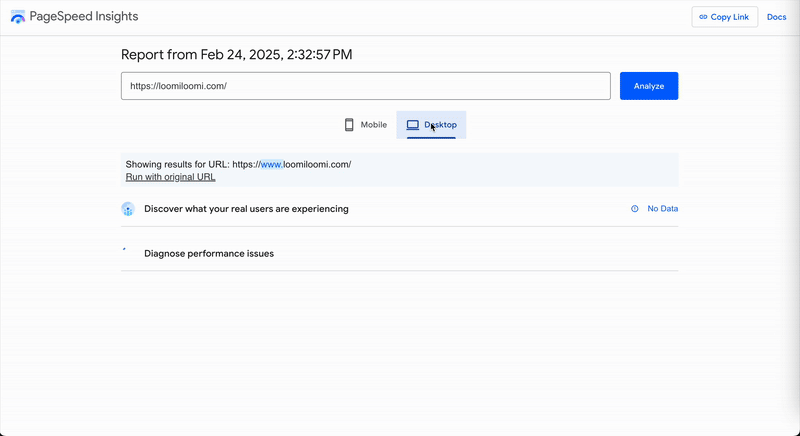
pagespeed.web.dev
Performance Checklist
✔️ Compress & Optimize Images
Convert images to WebP and use tools like TinyPNG or ShortPixel to reduce file sizes.
✔️ Minify Your Code
Shrink CSS, JavaScript, and HTML using UglifyJS or CSSNano and remove unused code for faster loading.
✔️ Choose the Right Hosting (if needed)
Squarespace and website builders handle hosting for you. For WordPress, choose SSD storage and built-in caching or consider VPS/cloud hosting for growth.
✔️ Enable Caching (if needed)
Website builders already manage caching. For WordPress, use WP Rocket or W3 Total Cache and set long expiration dates for cached files.
✔️ Use a CDN (if needed)
Website builders like Squarespace already include a CDN. For WordPress or custom websites, use Cloudflare, BunnyCDN, or StackPath.
Helpful Resources
📌 Google PageSpeed Insights:Analyze your website’s speed and get improvement tips.
📌 Web.dev: Learn how to optimize performance step by step.
📌 TinyPNG: Compress images without losing quality.
📌 Cloudflare: Free CDN and security features for faster loading.
📌 WP Rocket: Top caching plugin for WordPress speed optimization.
✅ Security
Your website is like your home — you wouldn’t leave the front door unlocked, right? Security is the same idea. If your website isn’t protected, hackers, malware, and data breaches can slip right in. A compromised website can mean stolen customer data, weird spam links, or even getting blacklisted by Google. And once your visitors lose trust, it’s tough to win them back.
The most common security risks include:
Weak passwords that are easy to crack.
Outdated software with security holes.
No SSL certificate, leaving data exposed.
Unverified plugins or themes that can introduce malware.
If you’re using Squarespace, Wix, or another website builder, security is mostly handled for you — SSL, updates, and protections are built-in. But if you’re on WordPress or a custom-built website, keeping everything updated and using security tools is a must.
A secure website is about keeping your visitors safe, protecting your reputation, and making sure your website stays in business.


Security Checklist
✔️ Use Strong Passwords
Avoid common passwords; use a password manager.
✔️ Enable SSL (HTTPS)
Encrypts data and protects user information. Website builders like Squarespace handle this automatically.
✔️ Keep Software Updated
Regularly update WordPress, plugins, and themes to patch security vulnerabilities.
✔️ Limit Login Attempts
Prevents brute-force attacks by restricting failed logins.
✔️ Use Security Plugins (if applicable)
For WordPress, install tools like Wordfence or Sucuri for extra protection.
✔️ Remove Unused Plugins & Themes
Unused software can have security gaps. Delete what you don’t need.
✔️ Enable Two-Factor Authentication (2FA)
Adds an extra layer of security for logins.
Helpful Resources
📌 Have I Been Pwned: Check if your email or password has been compromised.
📌 Google Safe Browsing: See if your website has been flagged for security issues.
📌 Let’s Encrypt: Free SSL certificates for secure connections.
✅ Redirects
Redirects point visitors in the right direction. But if they’re done wrong, they can lead to confusion, slow loading times, and even harm your website’s SEO.
When set up correctly, redirects guide users from old pages to new ones, helping with things like broken links, page updates, or site restructuring. However, poorly implemented redirects can cause your website to crawl instead of run.
The main types of redirects you should know about:
301 Redirects (Permanent) – Tells search engines and users that a page has moved permanently. This is the go-to redirect for most situations.
302 Redirects (Temporary) – Used when you want to temporarily redirect users but plan to bring the original page back.
Meta Refresh – Often used for quick redirects but not SEO-friendly — avoid using them.
If you’re using Squarespace, Wix, or another website builder, they usually handle redirects automatically. But if you’re on WordPress or a custom-built website, managing redirects yourself is important to maintain site flow and SEO integrity.
Proper redirects aren’t just about fixing broken links — they also help with user experience and SEO. If you’ve restructured your website or changed URLs, setting up redirects properly will ensure users and search engines get where they need to go without issues.
Redirect Checklist
✔️ Use 301 Redirects for Permanent Changes
Always use 301 for pages that have moved permanently to maintain SEO value.
✔️ Use 302 Redirects for Temporary Changes
If the page is temporarily unavailable or under construction.
✔️ Avoid Meta Refresh Redirects
They’re slow, and search engines don’t like them. Stick with 301 or 302 for better performance.
✔️ Set Up Redirects for Changed URLs
If you’ve moved or renamed pages, use redirects to prevent 404 errors.
✔️ Test Redirects Regularly
Check for broken or incorrect redirects to avoid poor user experience.
Helpful Resources
📌 HTTP Status Codes: Learn about the different HTTP status codes and when to use them.
📌 Redirect Checker: Test if your redirects are working correctly.
📌 Screaming Frog: Crawl your website to find and fix broken links or incorrect redirects.
✅ Schema Markup
Schema markup is a type of code that you add to your website to help search engines understand and display your content better. It acts as a "translator" for search engines, giving them extra details about your pages, like ratings, events, product prices, or contact info.
This extra information helps your website stand out in search results. For example, a product page might show up with the price, availability, and review stars directly in the search snippet. This can make your listing more engaging and attract more clicks.
If you’re using website builders like Squarespace or Wix, schema markup is often handled for you. But if you’re using WordPress or a custom-built site, you might need to add it manually or use plugins to help.
In short, schema markup makes your pages more informative, improves search visibility, and could lead to more clicks and higher rankings. It’s a simple way to make your website stand out in search results.
I recently added schema markup for LoomiLoomi and will be writing a separate blog with detailed instructions on how to do it. Stay tuned for that!

Schema Markup Checklist
✔️ Use JSON-LD Format
This is the most recommended and widely used format for schema markup.
✔️ Add Schema for Key Elements
Include markup for products, reviews, articles, events, FAQs, and contact information.
✔️ Test Your Markup
Use Google's Rich Results Test to make sure it's working properly.
✔️ Update Schema Regularly
As your website changes, ensure your schema stays accurate and up-to-date.
Helpful Resources
📌 Schema.org: The official schema markup vocabulary.
📌 Google’s Structured Data Markup Helper: A tool to help you generate schema markup for your website.
📌 Rich Results Test: Google’s tool for testing your structured data and seeing how it appears in search results.
✅ XML Sitemap
An XML sitemap is a file that lists all the pages on your website in a format that search engines can read. XML stands for eXtensible Markup Language, which is a standard format for structuring data in a way that both humans and machines can read. Think of it as a map that guides search engines to the content they need to find, ensuring they don’t miss anything important. This is crucial for SEO because it helps search engines crawl and index your site more efficiently.
While navigation and internal links help search engines discover your content, an XML sitemap guarantees that even pages deep within your site or those not directly linked from your homepage are found. This is especially helpful for larger websites with lots of pages or complex structures.
If you’re using platforms like Squarespace or Wix, your XML sitemap is typically auto-generated, so you don’t need to worry about it. But if you’re on WordPress or a custom-built site, you might need to set it up yourself or use a plugin.
To check your XML sitemap, you can visit your sitemap URL, typically something like www.yourdomain.com/sitemap.xml, and see if it’s accessible. You can also use Google Search Console to verify that Google is able to read your sitemap and index your pages correctly. If your sitemap is not working as expected, it may be a good idea to troubleshoot or regenerate it through your platform’s settings or plugin.

XML Sitemap Checklist
✔️ Create or Verify Your XML Sitemap
If you’re on WordPress or a custom-built site, use a plugin like Google XML Sitemaps to generate your sitemap. For Squarespace or Wix, your sitemap is automatically generated.
✔️ Check Your Sitemap URL
Visit www.yourdomain.com/sitemap.xml to ensure it’s accessible. This is the typical location of your sitemap file.
✔️ Submit Your Sitemap to Google Search Console
Go to Google Search Console and submit your sitemap under the “Sitemaps” section. This helps Google crawl and index your pages more efficiently.
✔️ Ensure All Important Pages Are Included
Make sure your sitemap lists all critical pages, especially those that may not be easily discoverable through navigation or internal links.
✔️ Verify No Errors in Your Sitemap
Use tools like Google Search Console to check for any errors or issues in your sitemap.
✔️ Check for Updates
Regularly check and update your sitemap when you add or remove pages to ensure it’s always up to date.
Helpful Resources
📌 XML-Sitemaps.com: A tool to generate XML sitemaps for your website.
📌 Google Search Console: Submit your XML sitemap to ensure Google can crawl your site properly.
📌 Google Search Central: Learn more about XML sitemap structure and protocol.
Summary
Technical SEO can feel intimidating. It’s the most complex part of SEO, requiring a deeper understanding of how websites and search engines work. From optimizing website’s speed and security to setting up redirects and schema markup, these behind-the-scenes tweaks aren’t always beginner-friendly. But here’s the good news: you don’t have to do it all yourself. Whether you’re diving into the technical details or hiring a pro, getting these elements right ensures your site is fast, secure, and easy for search engines to crawl and index. It’s worth the effort — because when technical SEO is done well, it sets the stage for everything else to shine.
Over the past four parts, we’ve covered everything you need to dominate SEO:
The Basics: Laying the foundation for a strong SEO strategy.
On-Page SEO: Crafting content that both users and search engines love.
Off-Page SEO: Building authority through backlinks and online presence.
Technical SEO: Optimizing your site’s infrastructure for peak performance.
Together, these elements create a powerhouse strategy to boost your rankings, drive traffic, and grow your online presence.
What’s Next?
Stay tuned! In the next few days, we’ll be sharing a FREE, downloadable SEO checklist to help you put everything you’ve learned into action. Don’t miss it — your website’s future self will thank you!